Events
A Celebration of The Art & Craft of Print – St Jude’s at Mottisfont
09 May 2026
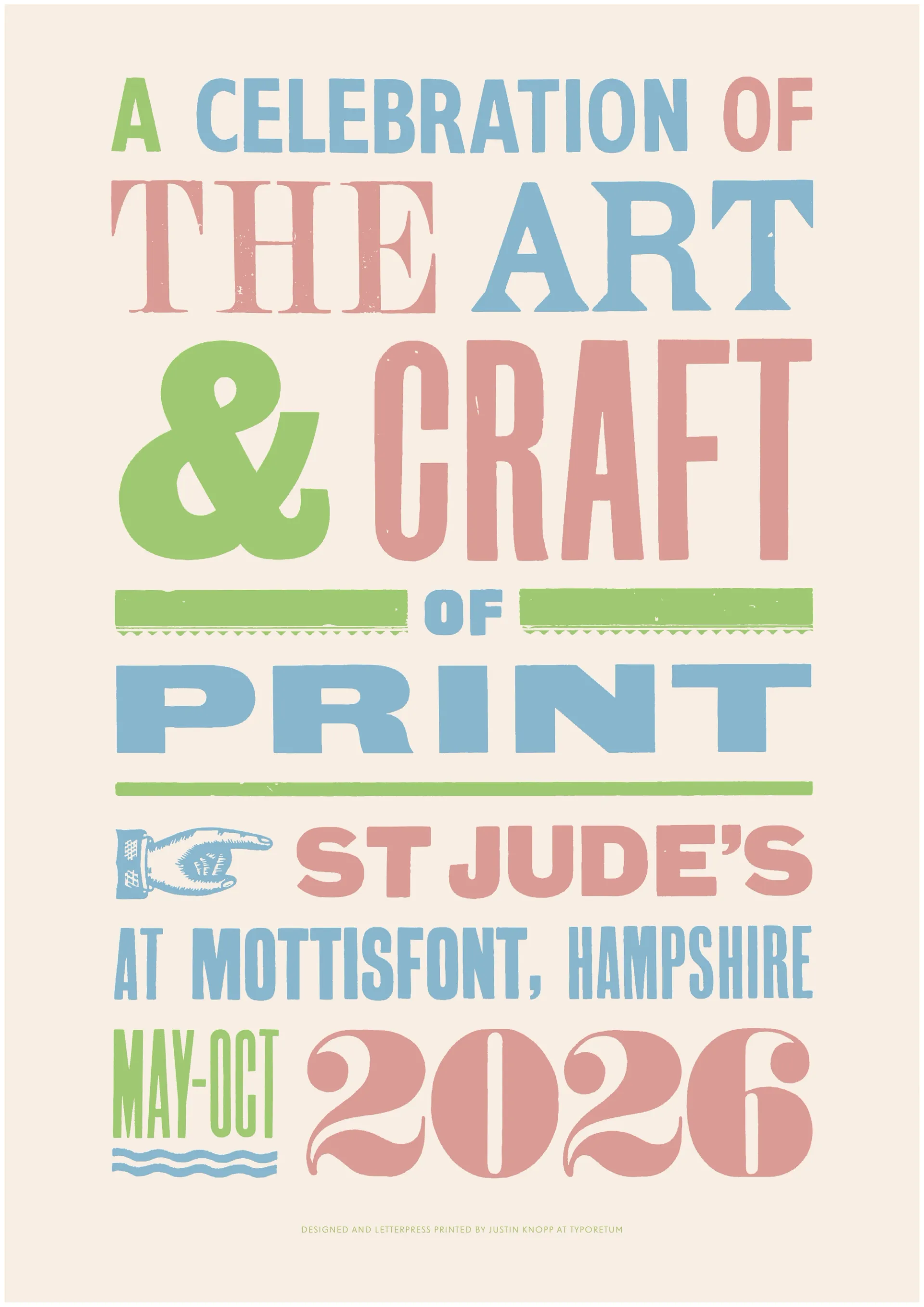
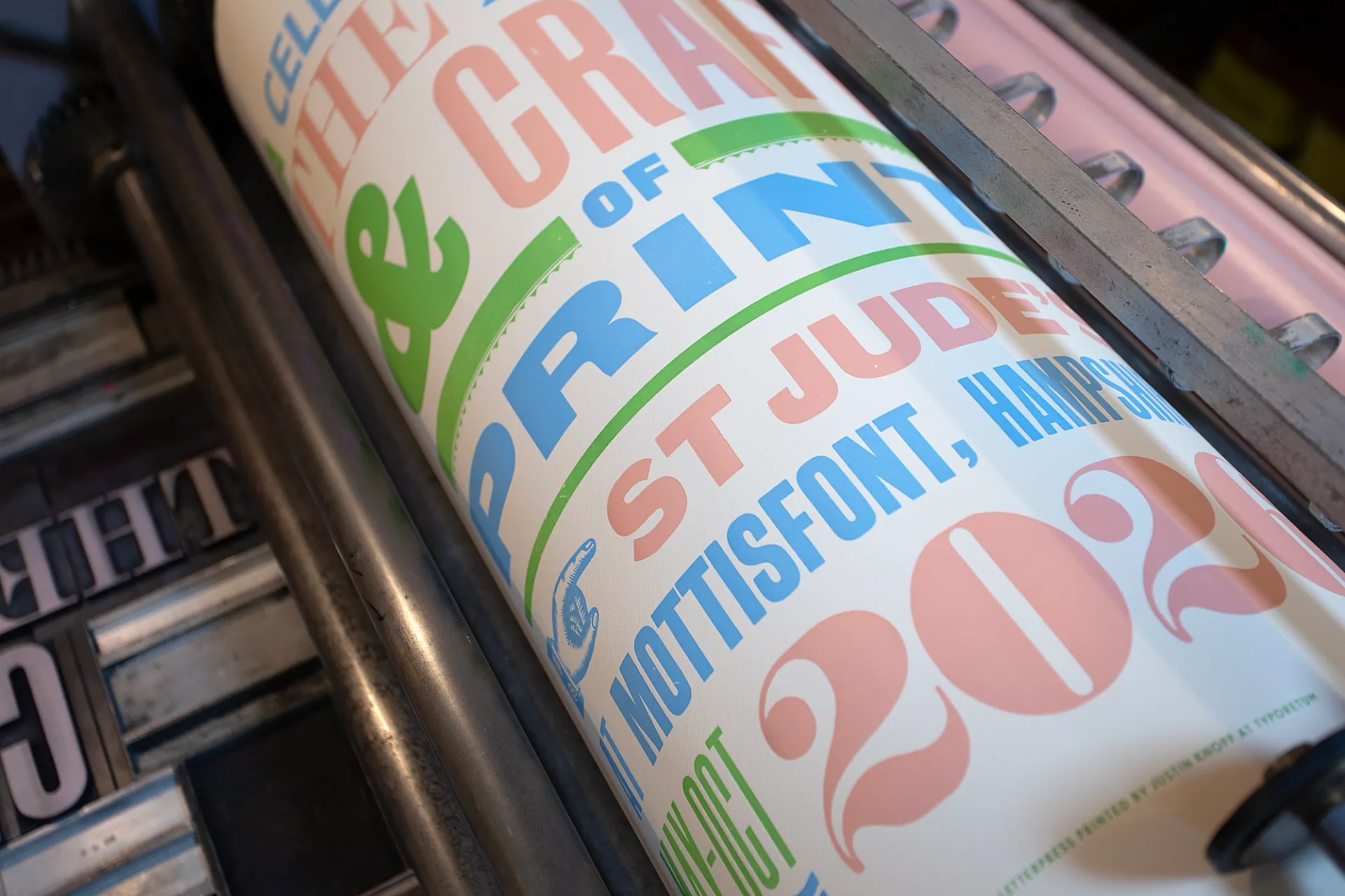
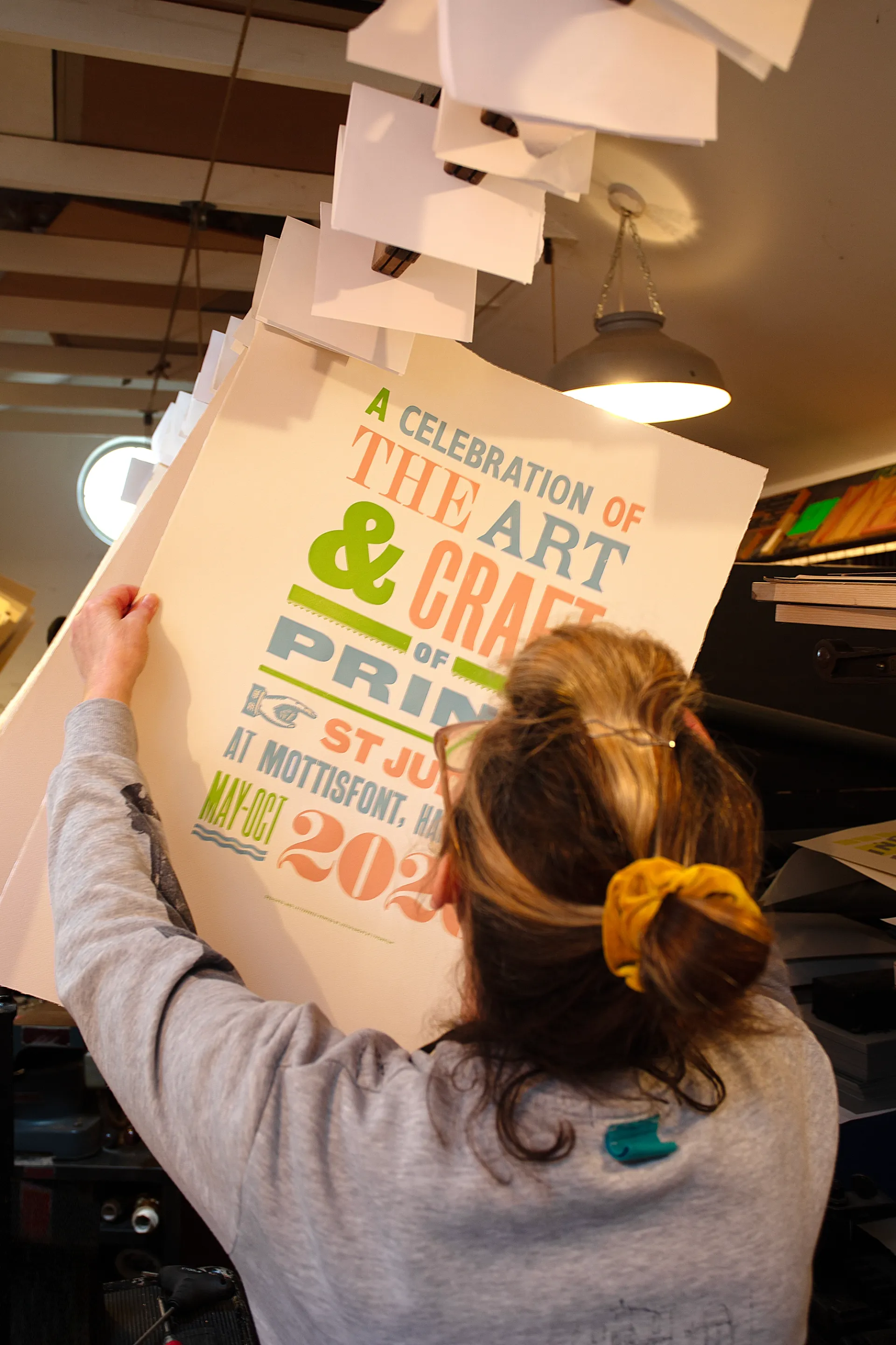
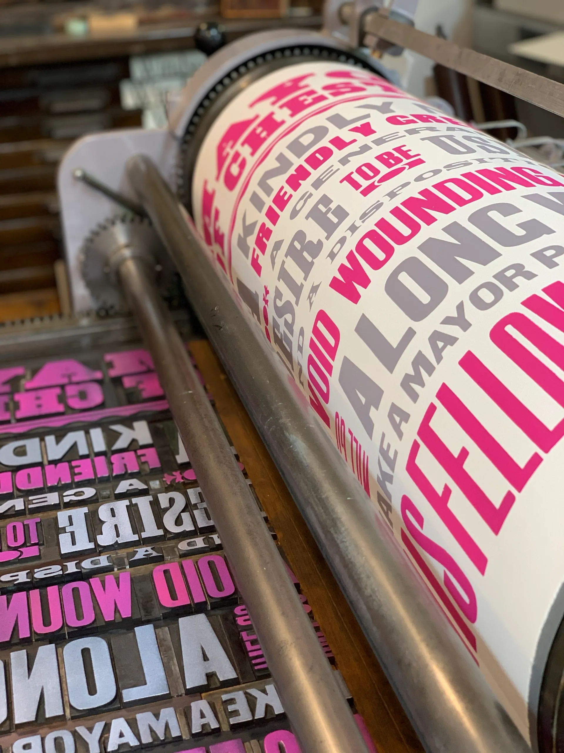
We’re delighted to share that St Jude’s has commissioned us to create a commemorative letterpress print for The Art & Craft of Print — a major new exhibition at NT Mottisfont, Hampshire, running from 9th May to 1st November 2026.
Curated in partnership between the National Trust and St Jude’s — whose commitment to British printmaking stretches back more than twenty-one years — the exhibition is one of the most comprehensive shows of UK printmaking assembled to date. Nearly thirty artists working in Britain today are represented, their work shown alongside prints by influential twentieth-century figures. What makes the exhibition particularly engaging is its interest in process as well as product: tools, sketchbooks, proofs and studio material sit alongside finished works, inviting visitors to look more closely at how a print actually comes into being. Techniques on show range from linocut and screen print to wood engraving, etching and letterpress.
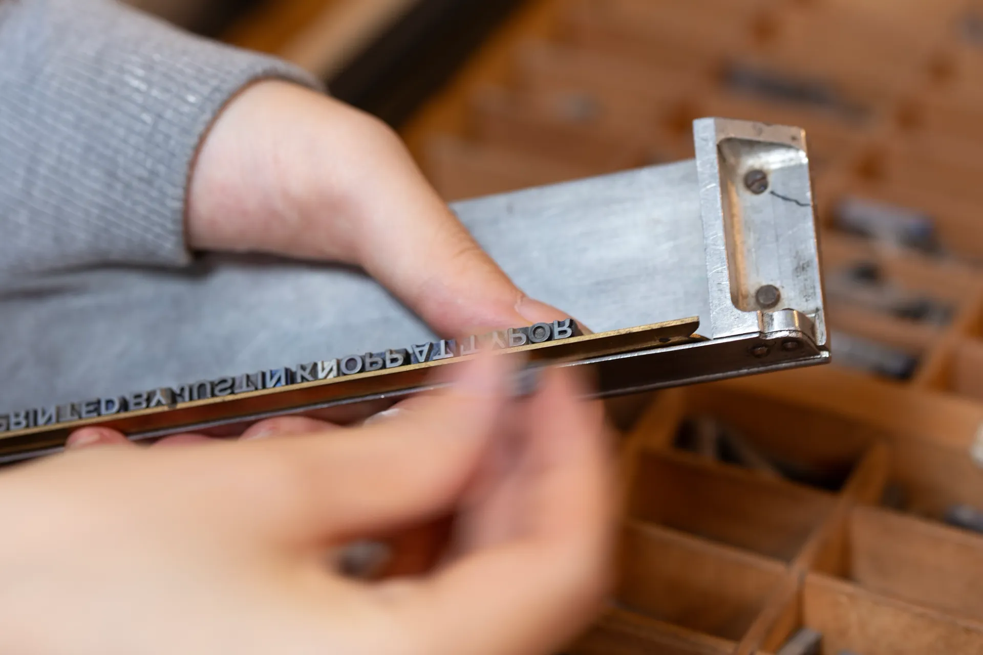
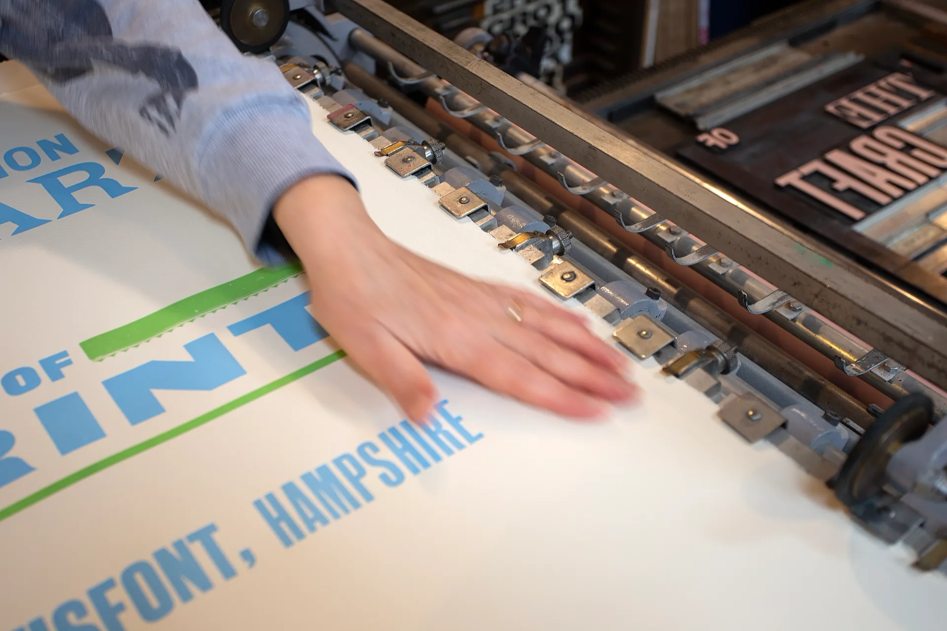
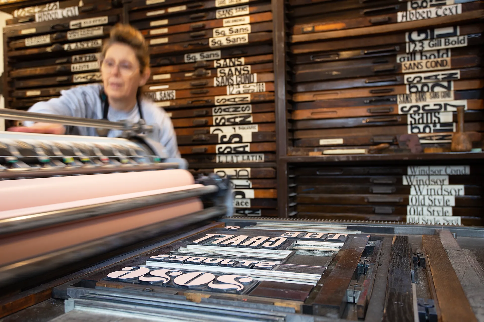
We designed and hand printed the commemorative print, in an edition of 100 copies, on our 1950s proofing press. The text was set in vintage wood type throughout — fitting for a show that places craft and material process at its centre. For the colour palette, we drew inspiration from the gardens at Mottisfont and we chose to print onto Somerset Velvet Antique, a 100% cotton paper made at the historic St Cuthbert’s Mill in Somerset. We selected the Antique shade of the paper as we felt this has a warm, soft sandstone tone that echoes the stone of the house at Mottisfont itself.
Alongside the poster commission, our Founder (and chief printer!) Justin Knopp will be exhibiting three of his own letterpress prints as part of the main show — each is printed from wood type and a range of experimental materials.
Featured artists:
John Broadley, Christopher Brown, Chloë Cheese, Clare Curtis, Anne Desmet, Melvyn Evans, Beatrice Forshall, Jonathan Gibbs, Linda Green, Peter Green, Alistair Grant, Jonny Hannah, Sharon Hannah, Mark Hearld, Clive Hicks-Jenkins, Justin Knopp, Ed Kluz, Edwin La Dell, Angie Lewin, Mick Manning, Penfold Press, Sheila Robinson, Charles Shearer, Bronwen Sleigh, Emily Sutton, Robert Tavener and Matt Underwood.
The Art & Craft of Print is open daily 11am–4.30pm until 1st November 2026. Entry is included with standard Mottisfont admission; free for National Trust members. No booking required.
Full details are available on the National Trust website. Work from the exhibition will be available to purchase through St Jude’s. Copies of our letterpress print created for the exhibition can be purchased here >
Events
Gmund Unfolded Festival 2026
01 May 2026
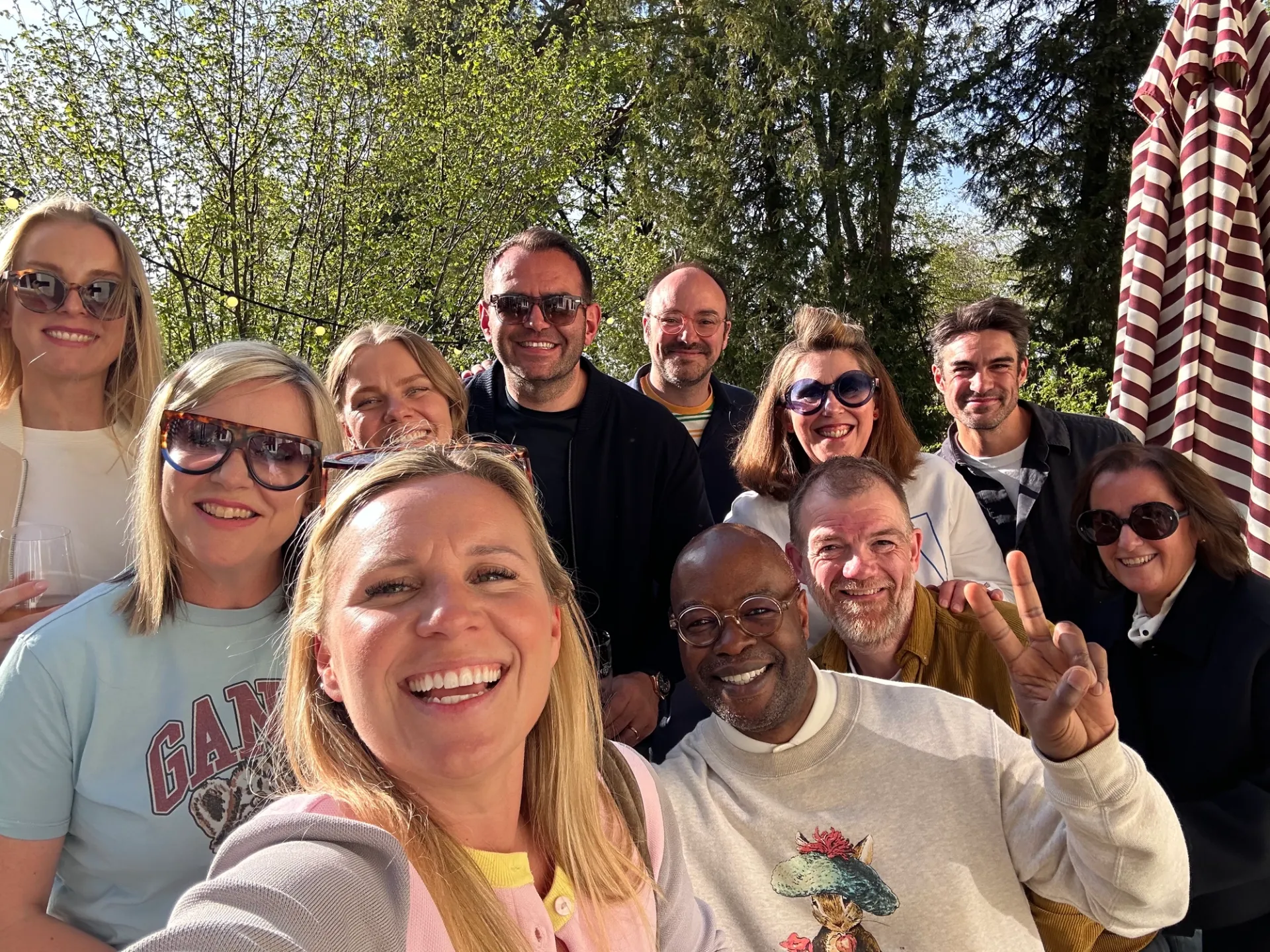
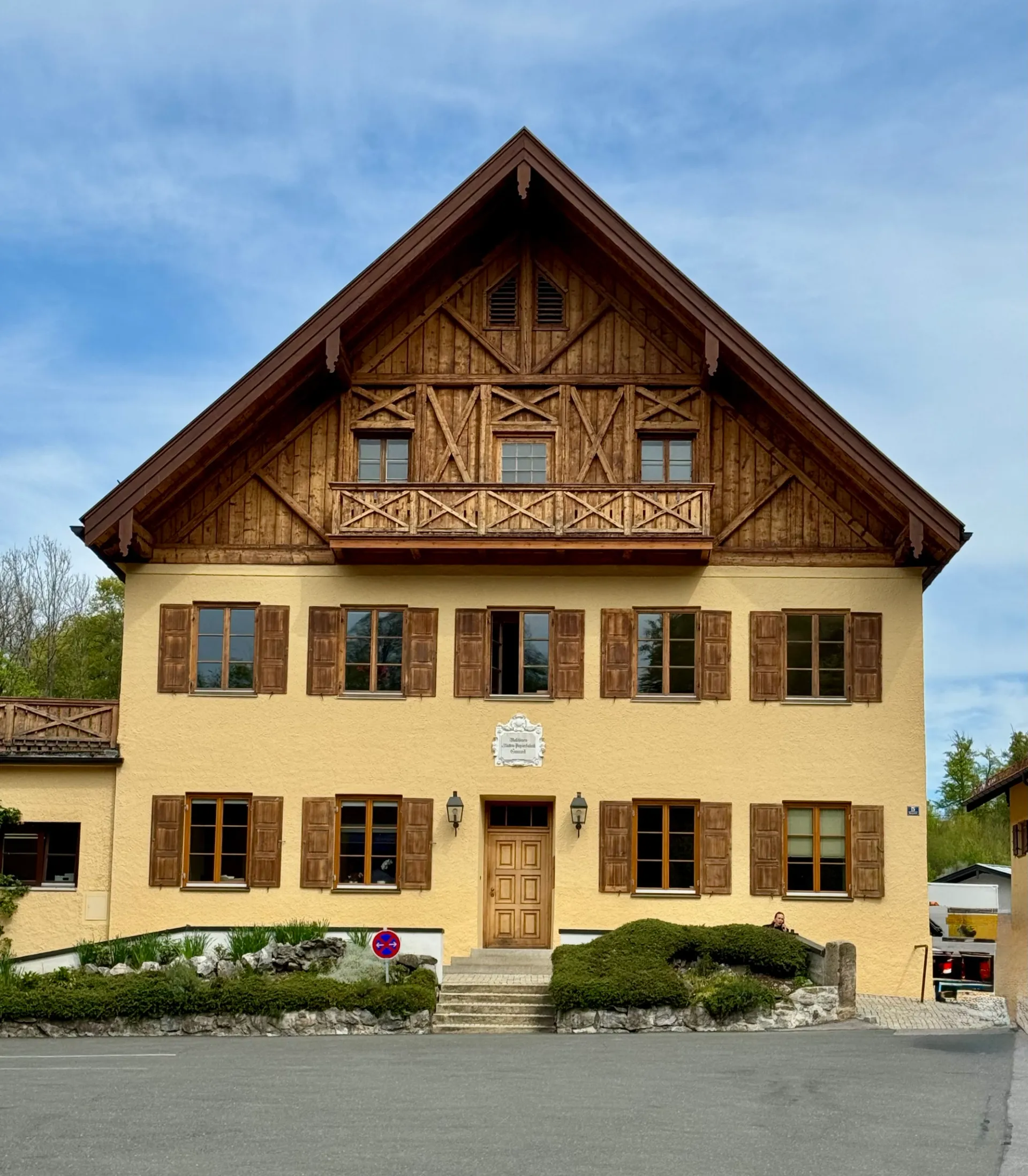
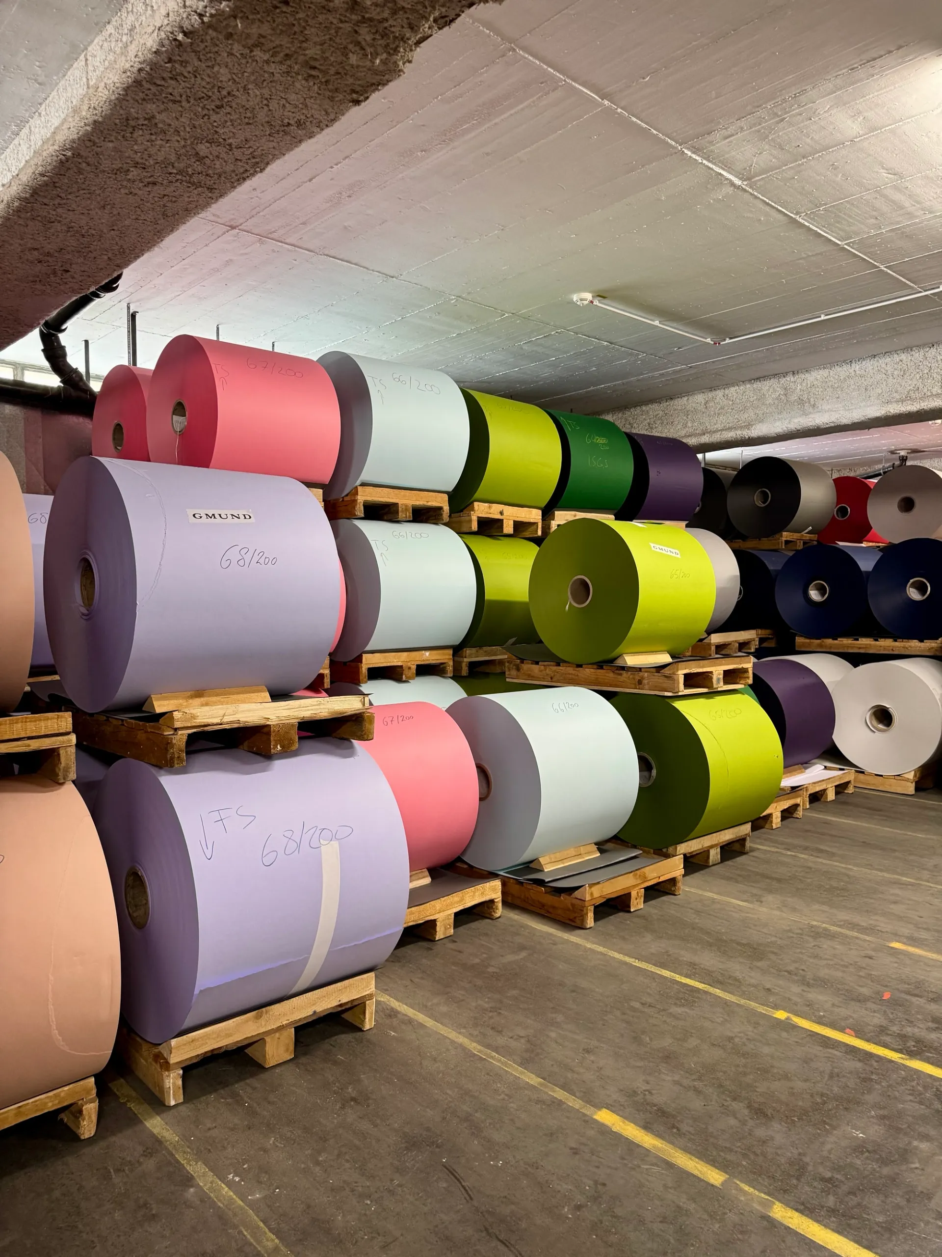
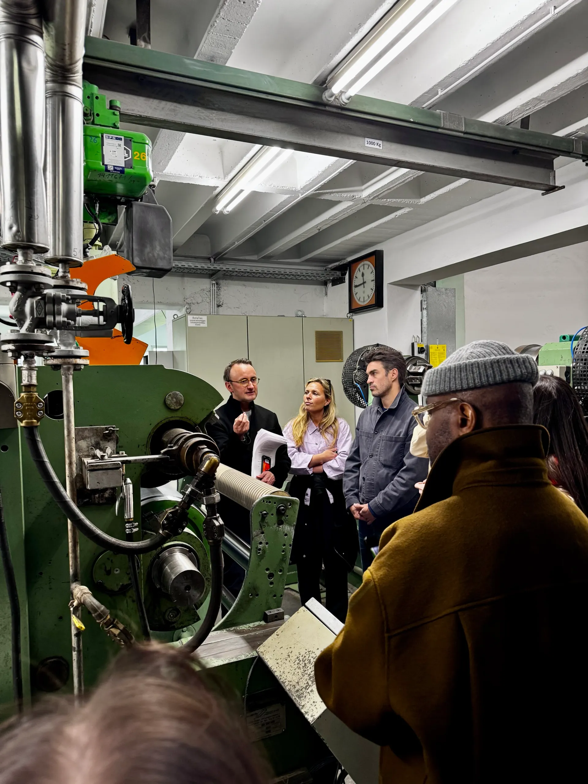
I had the absolute pleasure of joining the GF Smith team alongside colleagues from our print and design community to attend this year’s Gmund Unfolded Festival at Gmund on Lake Tegernsee, Bavaria. The trip also included a tour of the beautiful Gmund Paper Mill, which was an unforgettable experience for anyone passionate about paper, print, and design.
The Unfolded Festival 2026 brought together creatives, printers, brand ambassadors and speakers from business and design to celebrate the evolving role of analogue communication and craftsmanship.
“People love paper” is the mantra of Florian Kohler, owner of Gmund Mill, which has been in his family for four generations.
His big question: How do genuine, lasting relationships between companies and their customers develop? Analogue touchpoints play a crucial role by generating experiences that evoke emotion, foster closeness, and convey a sense of value.
PEOPLE LOVE PAPER and the opportunity to feel something real. This is precisely where its strength lies: paper anchors messages in a way that digital communication does not have the same impact
The festival was the perfect environment for these relationships to be formed, and there was such an energetic exchange of ideas, collaboration and creative buzz throughout the day.
Alongside the keynote speakers, international specialists from the fields of design, print, brand, and materials showcased their work, creating opportunities to connect, exchange ideas and leave inspired by the possibilities that paper and human connection can achieve together.
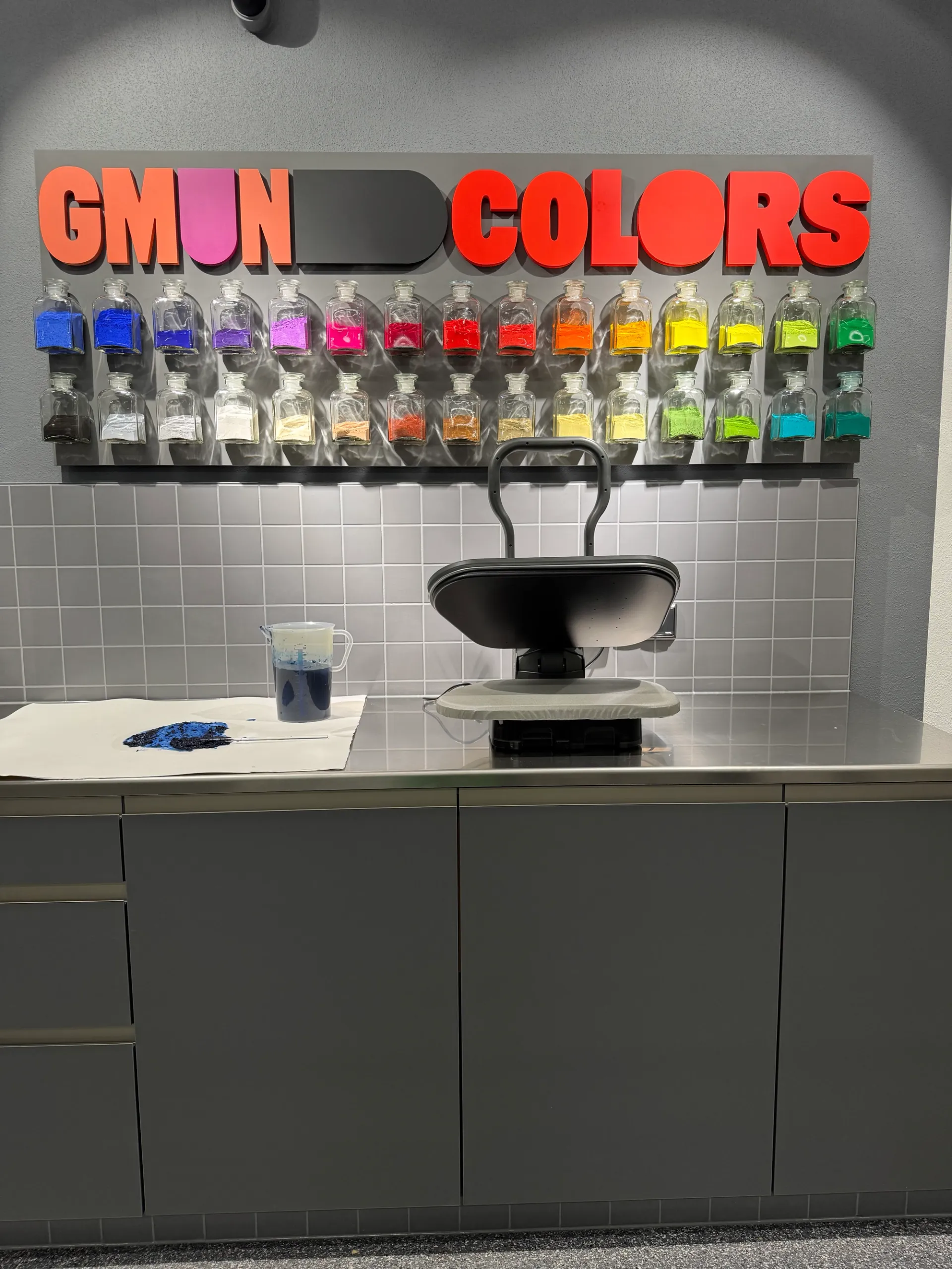
I was particularly excited to see the new Gmund Colors brand launch, featuring ten new shades of paper. Florian explained that rather than simply describing colour, each shade has been given an emotive adjective – a thoughtful approach that immediately creates a deeper connection to the collection. I’m incredibly excited to share these new papers and explore the creative possibilities they offer.
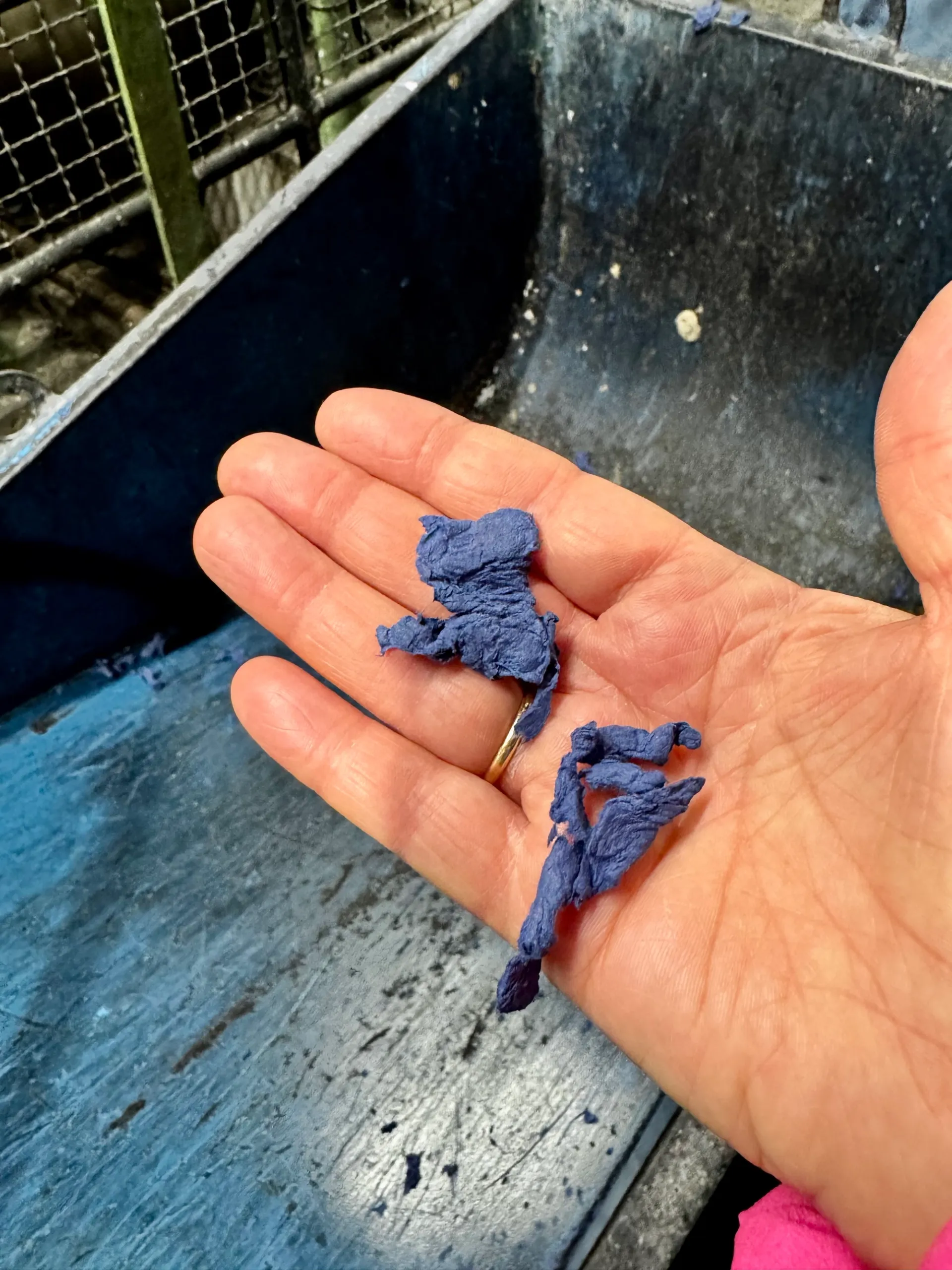
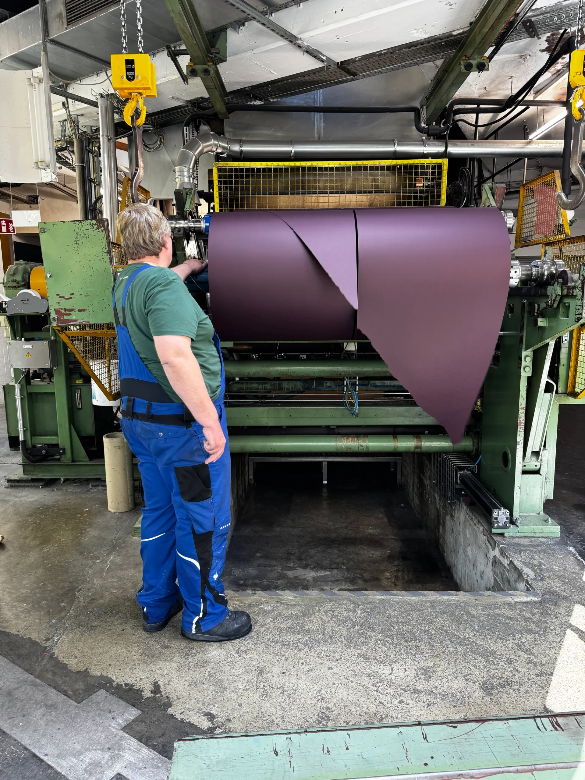
On day two, Max Huber, CMO of Gmund, gave us a tour of the mill, offering a fascinating insight into the papermaking process, the magnificent papermaking machines and the equally magnificent humans there.
Fun fact: a human being checks every single sheet of paper before it gets packed for sale. I watched the team working on quality control, and the rhythm and movement of the process felt almost like a choreographed dance – I was mesmerised.
A huge thank you to GF Smith for being such wonderful conference companions, and to Gmund for hosting such an inspiring and thought-provoking festival.
Cecilia Knopp - April 2026
Comment
Craft as a value, not just an aesthetic: Our BrewDog story
07 March 2026


Watching BrewDog’s fall is hard — not from loyalty to the brand, but out of sadness for the people caught in the wreckage. Around 484 jobs have already gone, and roughly 220,000 ‘Equity Punk’ investors now look likely to be left empty-handed. Tilray Brands bought BrewDog for just £33 million, down from a peak valuation of $2.7 billion. As trade union Unite noted, a company does not lose 97% of its value in nine years without catastrophic mismanagement.
Just over a decade ago, at the height of the craft beer boom, we worked with United Creatives on a wholesale BrewDog rebrand — one with craft at its core. The aim was to express a genuine passion for brewing through the identity, print and labelling. The vision was very much to combine the craft of graphic design with the craft of beer.
We turned to the dusty cases of vintage metal and wooden letterpress type in our library. Every letter, ornament, texture and graphic element was proofed by hand, then painstakingly translated by United Creatives into a bold digital identity: distinctive, characterful and, above all, authentic. It felt honest and authentic. The dog was hand-drawn in the attic at United Creatives, and we had it etched out of a block of maple wood for letterpress printing.
Some years later, BrewDog quietly abandoned that identity, reverting to the kind of soulless vector graphics and frictionless digital design it had once defined itself against. It wasn’t just an aesthetic shift; in hindsight, it signalled a deeper break from the values the brand had loudly claimed to champion.
What followed is familiar: allegations of a toxic culture; a BBC documentary scrutinising co-founder James Watt; a 2024 backlash after the company said it would no longer pay the living wage; and five consecutive annual pre-tax losses totalling over £148 million. Both founders have now gone — Watt stepping down as CEO in 2024, and Dickie leaving entirely in August 2025. The self-styled rebellious, people-first alternative to corporate brewing had, in the end, become exactly what it claimed to hate.
We’re still proud of that rebrand. Whether it would have changed BrewDog’s trajectory, we’ll never know. But there’s symbolism in the moment the company traded a craft identity — and everything it represented — for something shinier and easier. Sometimes the brand really does tell the story.
A short film showing our making of the Brewdog branding can be viewed here >
Events
Trainspotters T30 Exhibition – Grow Up Art at Atom Gallery
21 February 2026


To mark the 30th anniversary of Trainspotting, Grow Up curated a special exhibition bringing together 30 artists to celebrate the film’s cultural legacy.
The concept was simple: each artist would create a new piece of work responding to, or riffing on, the enduring influence of Trainspotting. The result is a diverse and playful collection of works that reflect the film’s lasting impact on art, design and popular culture.
We’ve been lucky enough to collaborate with Blam and Jack of Grow Up on a number of letterpress and foil editions over the years, so it was a pleasure to attend the friends and family launch at Atom Gallery. The exhibition was perfectly timed to coincide with the 30th anniversary of Danny Boyle’s now iconic film and it was also a very personal project for Blam, who was part of the design team that created the graphics for the original film.
For the exhibition, we helped produce ‘Snoopdogging’, a limited-edition print created exclusively for the show. The piece was letterpress printed onto Pur Cotton Cocaine White 350gsm stock, creating a beautifully tactile finish that complements the bold design.
It was a brilliant evening celebrating a film that continues to influence artists and remains culturally relevant three decades on. Exhibition runs from 21 February to 14 March 2026.
We love working with artists so get in touch if you would like to talk about creating a letterpress printed or hot foil edition of your work.
Studio News
Found in the Feed: The Story Behind Our Logotype
28 January 2026


Just over a decade ago, whilst embarking on a rebranding exercise for Typoretum, I stumbled across a type specimen on the Retypefoundry Instagram feed. I had spent weeks trawling through typefaces in search of something that would do justice to our new brand identity — distinctive and individual, yet clean and bold. I took a screenshot, filed it away, and set about trying to track it down. No luck. It didn't appear to be available from any digital foundry, and no amount of searching turned up a licence to purchase it.
Yet nothing else I found came close. There was something about 'Lewis' — as it appeared to be known — that I simply couldn't shake.
A bit of determined Googling eventually led me to the designer: Alexandre Saumier Demers, co-founder of Coppers & Brasses, a digital type foundry based in Montreal, Canada. I dropped him an email on a whim, half-expecting nothing to come of it. Instead, Alexandre replied with characteristic warmth, explaining that the typeface's full name was Lewis Blackboard, that it had begun life as his Masters project, and that he felt it still needed a little refining before he was ready to release it commercially. Then came the generous part: he offered to let us use Lewis Blackboard for our logotype — and, extraordinarily, he went ahead and cleaned it up specially, sending us working font files to use freely in our branding.
We were, to put it mildly, rather bowled over.
From there, things took on a life of their own. We set about producing a full alphabet of Lewis Blackboard in perspex-faced poster type, so that we could use it in the workshop and print a limited-edition promotional letterpress specimen poster. We enlisted the brilliant Thomas Mayo to lasercut each letter from 3mm fluorescent green transparent perspex — a vivid material that suited the typeface's character perfectly. What followed were many long hours carefully glueing each cut shape onto strips of 3mm perspex, which we then mounted onto planks of maple wood, before chop-sawing the whole lot down to separate each individual letter. We made two complete sets of Lewis Blackboard in 12-line (pica) poster type — and by way of a small thank you to Alexandre, we shipped one of them across to him in Montreal, along with a selection of the posters we had designed, typeset and printed directly from the type.
Sometimes things really do seem meant to be. Looking back, it's hard to believe it all began with a single screenshot. Alexandre's kindness and generosity continue to astound us, and we remain all the fonder of our logotype for knowing the story behind it.
Collaboration
Cardozo Kindersley Christmas Cards 2025
19 December 2025


Whenever we receive an email from the Cardozo Kindersley Workshop, we know we’re in for a hand-lettered treat.
If you haven’t come across their beautiful work before, the Workshop is world-renowned for its letter cutting and hand carving, working in wood, stone, metal and glass, as well as creating bespoke designs for print. We’re also very fortunate to have them close by in East Anglia.
Each year, the Workshop designs and prints a new Christmas card for customers, family and friends. This year, we were invited to collaborate on a design created by team member Emily Burton. We met with Emily and fellow letter cutter John Mawby to review the artwork and explore production options and colourways.
We were blown away by Emily’s hand-drawn illustrations and felt honoured to help bring them to life in print. Our role was to digitise the artwork for the letterpress process.
The Workshop was keen to explore how the design might work with a combination of foil and letterpress printing, so together we experimented with a range of ink and foil colourways and discussed the best approach for production.
Emily and John each selected their preferred colourway, then asked us to create a surprise ‘Typoretum’ version. This made us slightly nervous and, as we couldn’t agree on just one idea, we each chose one.
To prepare Emily’s hand-lettered illustrations for print, we first scanned the artwork. From there, we resized it and carefully created the vector paths needed for plate etching, remaining faithful to Emily’s hand-drawn work.
Once the artwork was ready, we separated the colours into individual layers for printing. In letterpress, each colour requires its own plate and its own pass through the press, so careful planning at this stage is essential.
If you’d like help bringing your own artwork to life through letterpress or hot foil printing, we’d love to hear from you.
Studio News
A luxury wedding stationery suite for Eleanor & Ivo
02 March 2025


In early January 2025, we received an enquiry from Eleanor, who was planning her wedding for 31 May and needed her invitations ready by the end of February. It was a very tight schedule, but we always like to say yes.
Eleanor was an absolute dream to work with. She arrived with some beautiful ideas, and together we developed them into a design that brought her vision to life. It’s always such a privilege to work with couples at this stage, helping them create what many consider to be the most important piece of stationery they will ever send.
For Eleanor and Ivo’s invitations, we created a sculptural foil emboss of an iris on the front of the folder. Inside, the main invitation was mounted on the right-hand page, while a pocket on the left held the additional inserts and information cards.
The suite was produced using Colorplan papers from GF Smith in a contrasting palette of Azure Blue, Bright Red and Bright White. The mounted invitation and details card were finished with a beautiful Coltskin emboss, adding extra texture and contrast to the design.
The result was a beautifully elegant and tactile invitation suite that was truly special for guests to receive.
If you’re planning your wedding and would like to create bespoke letterpress or foil stamped invitations, we’d love to help bring your ideas to life.
Publications
Meet The Typographer – an illustrated book by Gaby Bazin
09 September 2024


If you've ever been curious about the art of typography and the history of bookmaking, ‘Meet The Typographer’ by Gaby Bazin is a perfect place to start.
Published by Design for Today and translated from the French by Vineet Lal, this charming 36-page book is a colourful introduction to the world of type, brought vividly to life through the illustrations of award-winning artist Gaby Bazin.
In May 2024, translator Vineet Lal approached Justin for technical advice on the correct English terminology for printers’ tools and methods as he worked on the translation. Additional expert insight came from our dear friend, the late Graham Moss of The Incline Press.
The book’s real strength is its wide appeal — it is not a dry technical manual, but a visual treat designed to delight readers of all ages. Whether you're a seasoned designer, a curious student, or simply someone who loves beautiful books, you'll find plenty here to capture your imagination.
Meet The Typographer was selected by The Times in its round-up of 2024 Art Books of the Year and is available now from Design for Today — an ideal gift for the type-obsessed person in your life, or indeed for yourself.
Studio News
Wood type print commission for George Clarke’s Old House, New Home
01 September 2022
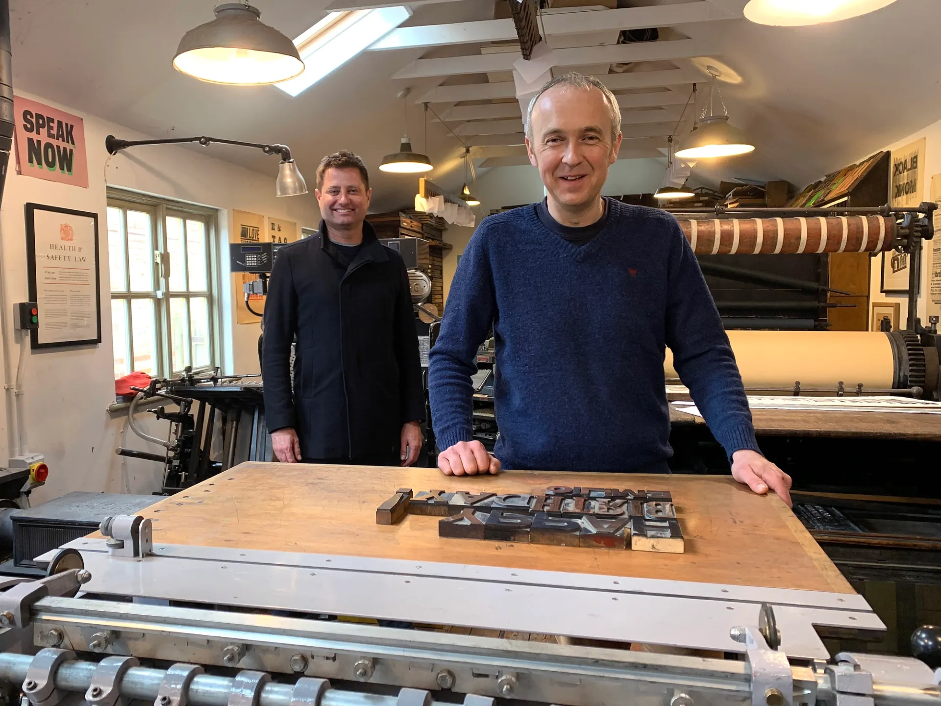
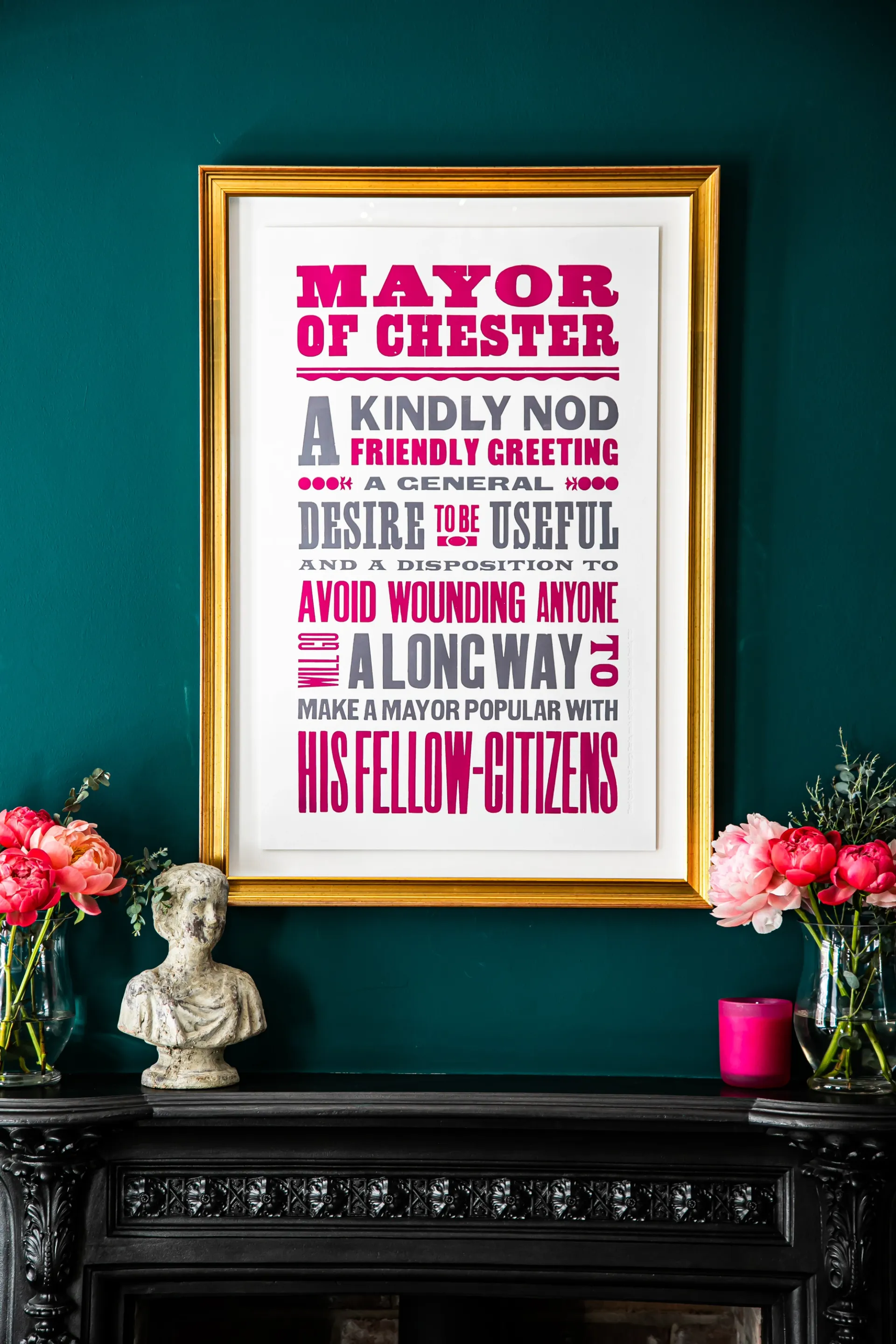
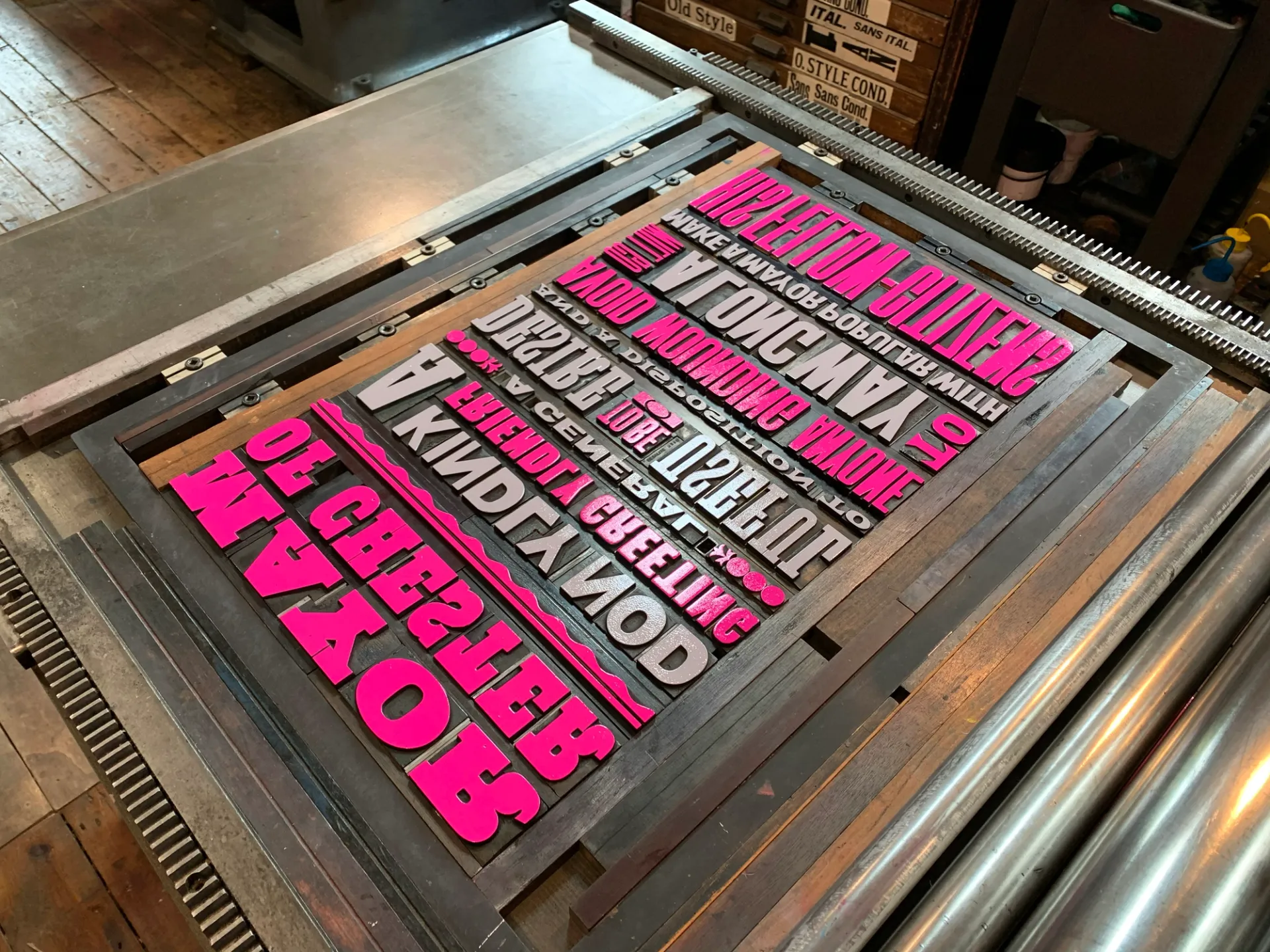
We were thrilled to be approached by Amazing Productions, the team behind George Clarke's Old House, New Home on Channel 4, to design and print a bespoke wood type print for a property featured in Series 8 of the programme.
The house in question was a Georgian town house in Chester — a building with a remarkable history, having once been home to a former Mayor of the city. That civic heritage formed the heart of our brief: to create a print drawn from texts connected to that mayoral story, set entirely in wood type and printed by hand in our studio.
The result was a bold piece of typographic art that conveys the former mayor’s rich character and apparent eccentricities, printed in two colours that echo the surrounding decor.
What made the commission especially memorable was a visit to the workshop from George himself. As the son of a Compositor, George has a deep and personal connection to the world of print, and the visit clearly held particular meaning for him. He took the time to learn about the craft, got hands-on with the typesetting, and pulled prints himself — a genuine engagement with the process, and a reminder of just how powerful the pull of letterpress can be for those with ink in their blood.
The episode, Chester and Banbury, aired in August 2022 and is available to watch on Channel 4 here >
Feature
Typoretum on film: a visit from Cornucopia Productions
05 January 2017


In 2016, filmmakers Ben Dickey and Beth Newell of Cornucopia Productions came to the workshop to spend time with me and the presses. The resulting five-and-a-half-minute film touches on something I've reflected on many times: when I first began collecting printing machines, the revival in letterpress was essentially unheard of, and I genuinely thought I might be the last person doing it — more a hobby, perhaps even an obsession. The film traces that journey from solitary enthusiasm to a practice that is now, happily, my day job.
Being filmed isn't something I find easy, and the idea of being captured on camera in a working environment felt, if I'm honest, a little daunting. But Beth and Ben brought with them a calm, unhurried approach that immediately put me at ease. They were clearly attuned to the rhythms of the workshop and took time to understand not just the technical processes of letterpress printing, but the thinking and feeling behind the work. By the end of the shoot, I had actually enjoyed the process — which surprised me more than a little.
The film was selected for screening at the Crafts Council's Reel to Reel Film Festival in 2017, where it premiered in London's West End. From there it travelled further than either Ben, Beth or I might have imagined: it was shown at the British Council and Crafts Council UK Pavilion at the 10th Cheongju Craft Biennale in South Korea — one of the world's most significant gatherings dedicated to contemporary craft.
To have the work at Typoretum represented in that context remains something I look back on with real pride. You can watch the film at cornucopia.tv, and I'd encourage you to do so — Ben and Beth made something that genuinely reflects what happens in this workshop.
Events
A Celebration of The Art & Craft of Print – St Jude’s at Mottisfont
A Celebration of The Art & Craft of Print – St Jude’s at Mottisfont
09 May 2026
Events
Gmund Unfolded Festival 2026
Gmund Unfolded Festival 2026
01 May 2026
Comment
Craft as a value, not just an aesthetic: Our BrewDog story
Craft as a value, not just an aesthetic: Our BrewDog story
07 March 2026
Events
Trainspotters T30 Exhibition – Grow Up Art at Atom Gallery
Trainspotters T30 Exhibition – Grow Up Art at Atom Gallery
21 February 2026
Studio News
Found in the Feed: The Story Behind Our Logotype
Found in the Feed: The Story Behind Our Logotype
28 January 2026
Collaboration
Cardozo Kindersley Christmas Cards 2025
Cardozo Kindersley Christmas Cards 2025
19 December 2025
Studio News
A luxury wedding stationery suite for Eleanor & Ivo
A luxury wedding stationery suite for Eleanor & Ivo
02 March 2025
Publications
Meet The Typographer – an illustrated book by Gaby Bazin
Meet The Typographer – an illustrated book by Gaby Bazin
09 September 2024
Studio News
Wood type print commission for George Clarke’s Old House, New Home
Wood type print commission for George Clarke’s Old House, New Home
01 September 2022
Feature
Typoretum on film: a visit from Cornucopia Productions
Typoretum on film: a visit from Cornucopia Productions
05 January 2017